Curtin University
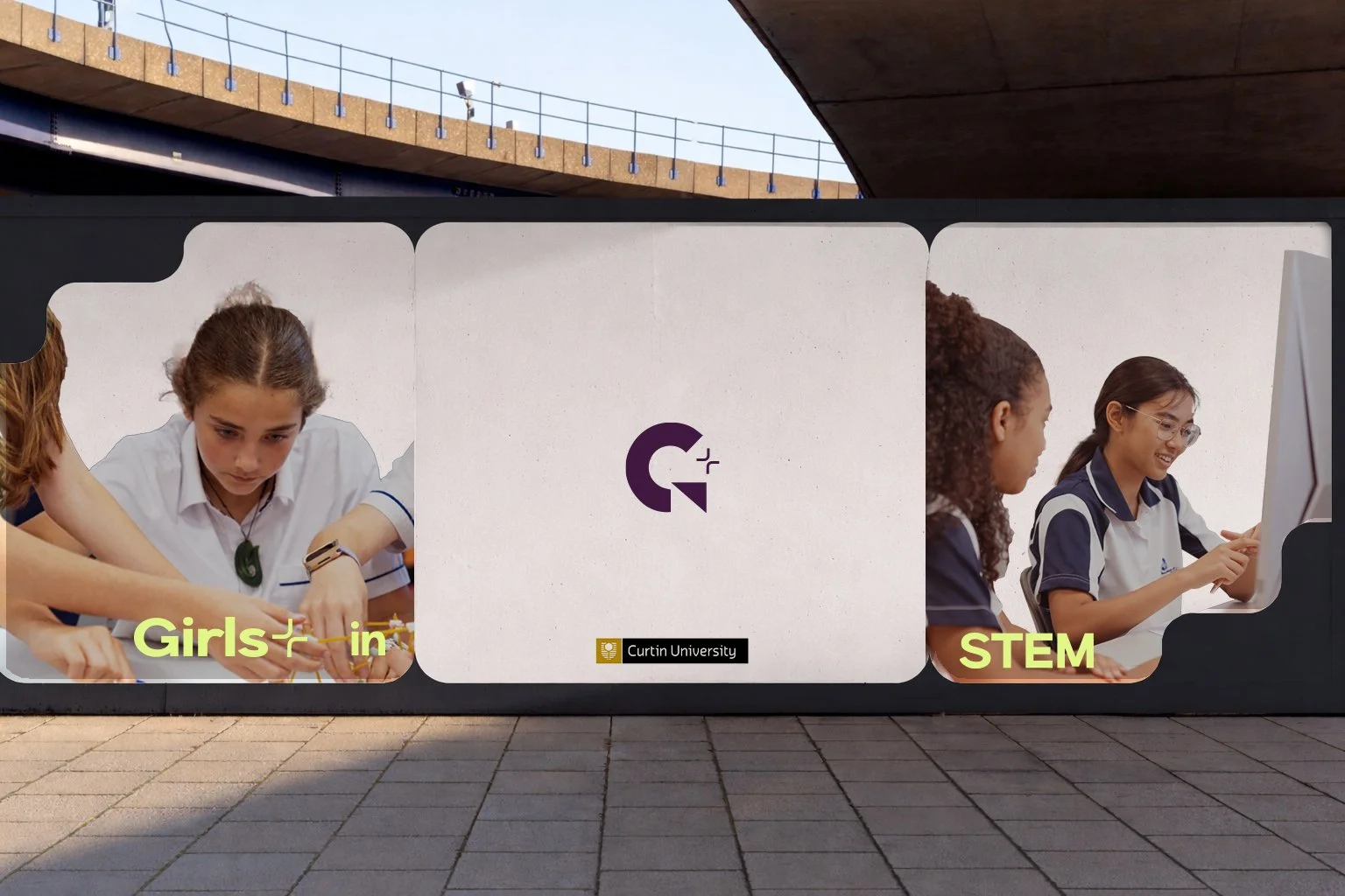
Girls+ in STEM
overview
Project
Scope of work
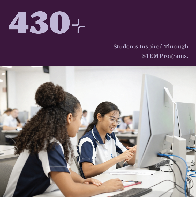
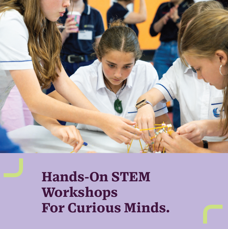
Target Audience

Curtin University Girls+ in STEM rebrand
Brand strategy, identity, logo design, socials content strategy
Students, Industry Partners and Sponsors

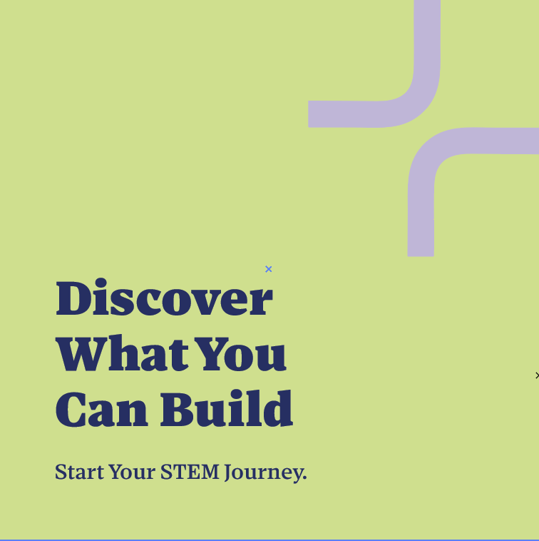


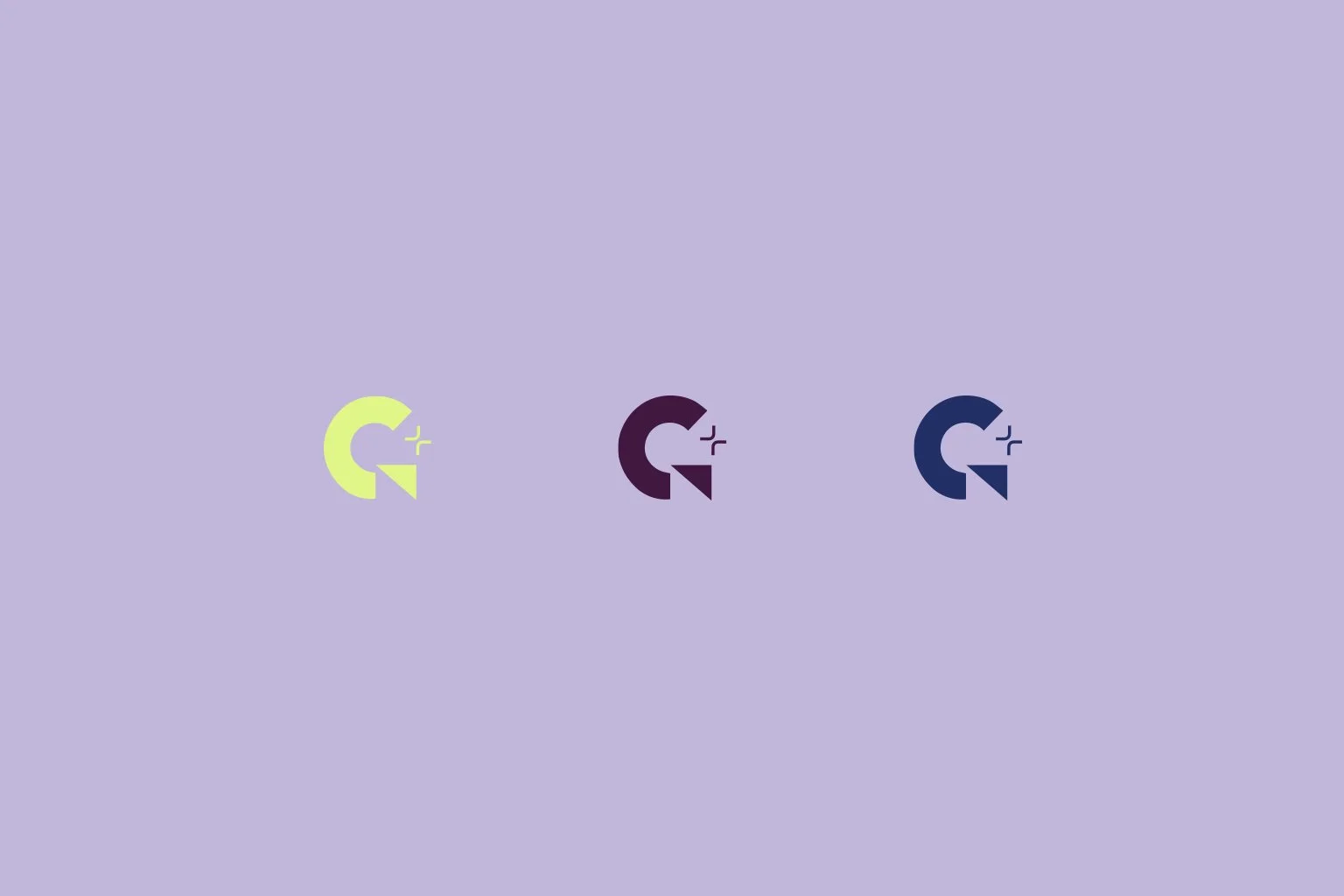
A bold and uplifting brand mark reflects the spirit of discovery and confidence at the heart of Girls+ in STEM. Inspired by interconnected scientific pathways, the form symbolises curiosity, collaboration, and the diverse journeys students take. The “+” symbol is constructed using two curved L-shapes rather than a traditional cross, softening the form while creating a more welcoming and inclusive visual gesture.
The modular structure of the symbol draws inspiration from scientific and engineered systems, where individual components connect to form larger networks. Much like molecules bonding or circuits linking, the intersecting forms represent collaboration, knowledge sharing
The colour palette balances credibility and curiosity, combining deep indigo and violet tones associated with intelligence, innovation, and scientific thinking. Bright lime accents introduce energy and experimentation, reflecting the excitement of discovery and encouraging students to explore possibilities within STEM.