UOB TMRW app
Contact Experience Redesign
UOB TMRW app- Contact Experience Redesign
UX audit, app store review analysis user journeys mapping, information architecture, Redesigned end-to-end contact experience, intent-based navigation flow development, WCAG 2.1 AA accessibility standards application, high-fidelity UI screens design
Project
Scope of work
Target Audience
Young adults and professionals, tourist and travellers, social media influenced users
TMRW by UOB is a mobile-first digital bank built for the ASEAN generation — designed to make banking feel effortless. However, beneath its polished interface, a critical gap emerged: when users encountered issues, accessing support became unnecessarily difficult.
This project focuses on redesigning the in-app contact experience — a crucial touchpoint where users need immediate and reliable assistance.
Existing Challenges
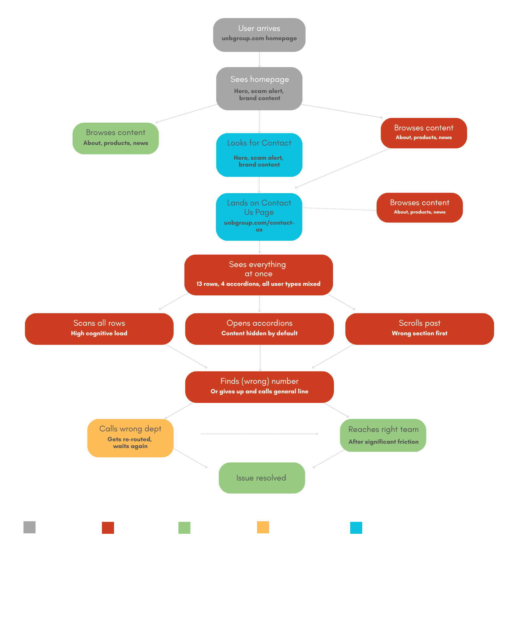
The UOB contact page currently presents a uniform and highly complex interface for all users—ranging from general enquiries to urgent fraud-related issues. With 13 rows, multiple accordions, and no clear intent-based routing, the experience can feel overwhelming and may lead users to contact the wrong department.
While users are ultimately able to resolve their issues, the level of friction encountered along the way may impact their overall experience and perception of the service. A more streamlined, user-centred approach could help improve clarity, reduce effort, and better support users in critical moments.
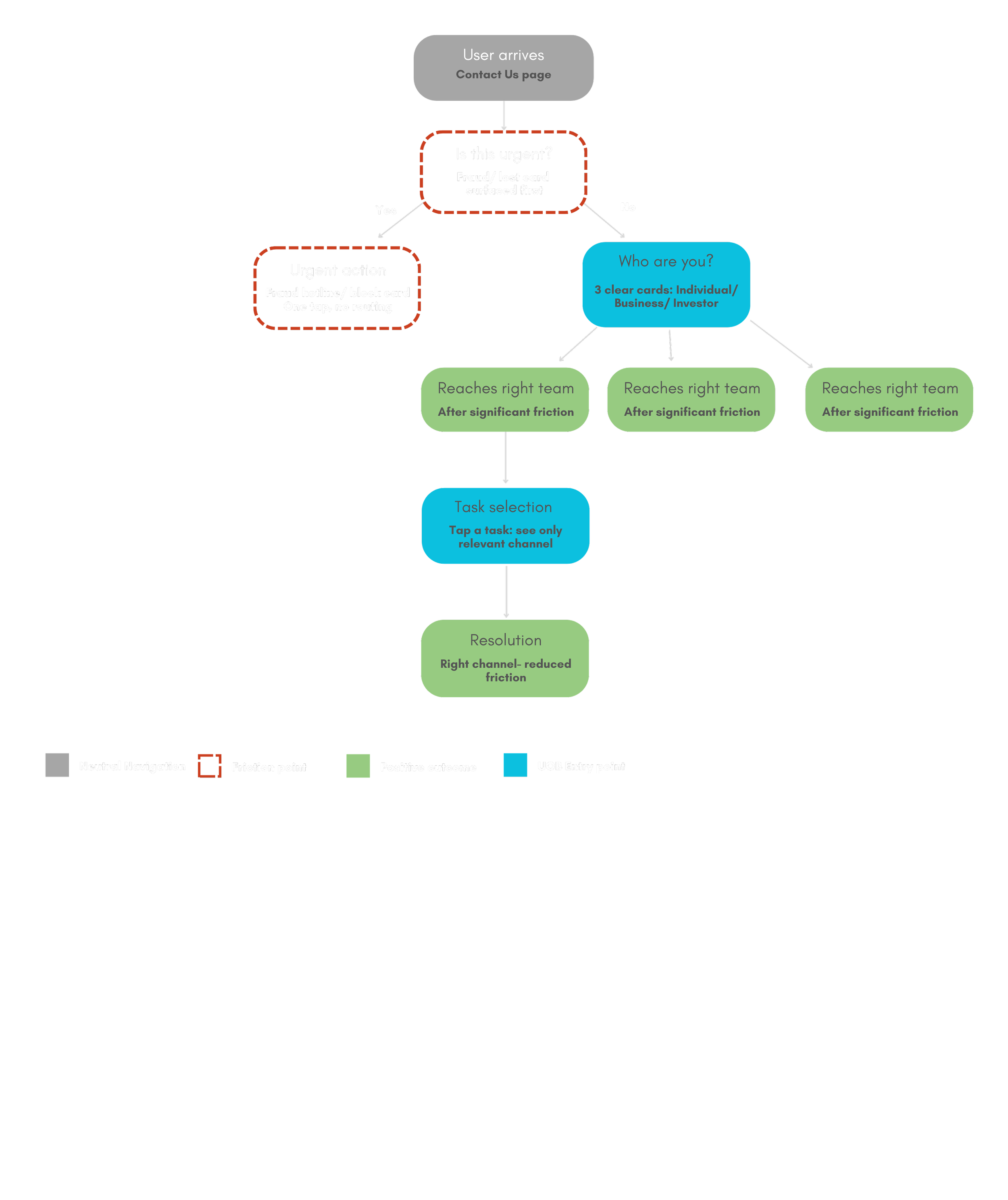
The redesign introduces an intent-first approach by immediately identifying whether a user’s issue is urgent, allowing critical cases like fraud or lost cards to be resolved instantly. Non-urgent users are then guided through identity-based routing (Individual, Business, Investor), ensuring they only see relevant options. This streamlined three-step flow reduces complexity, eliminates misdirection, and helps users reach the right channel quickly and confidently.
Re-structured User flow
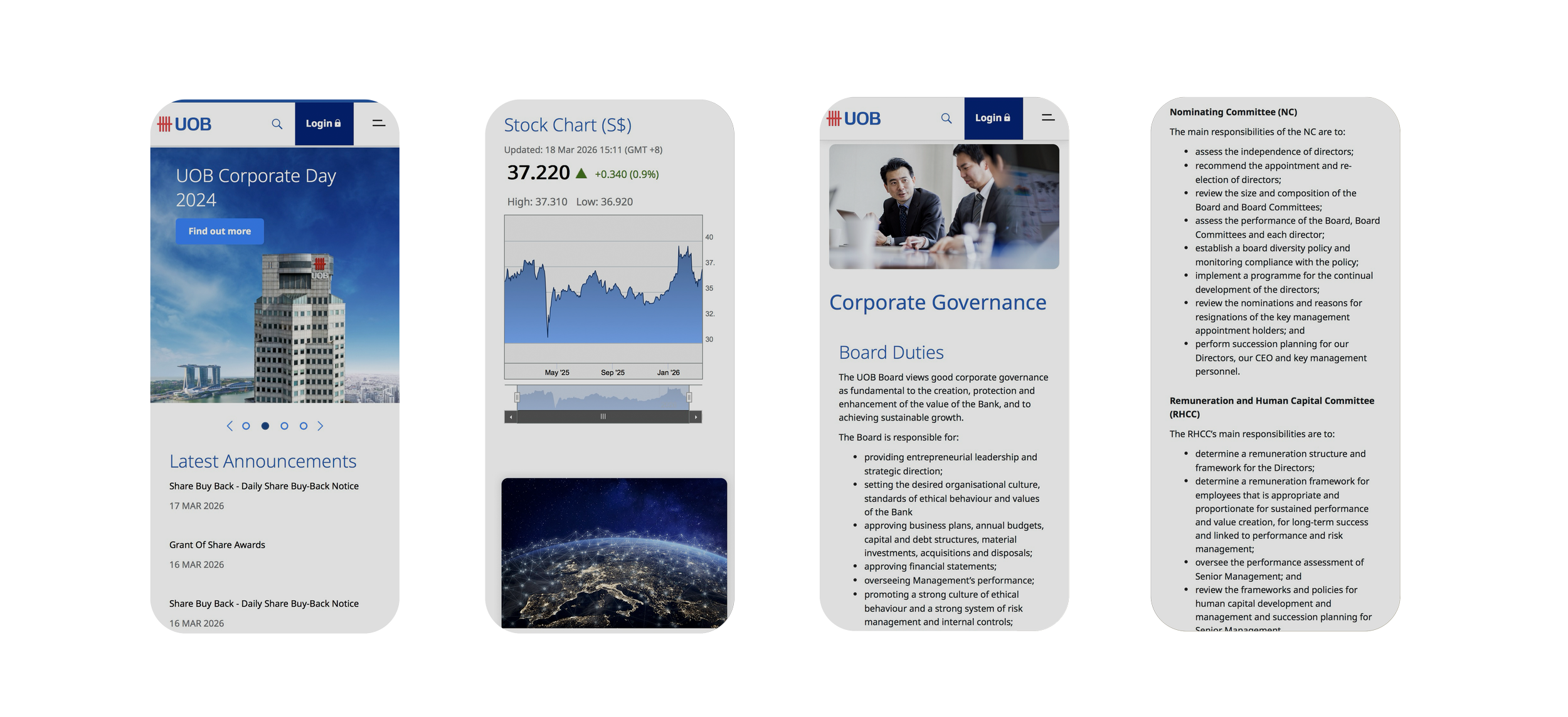
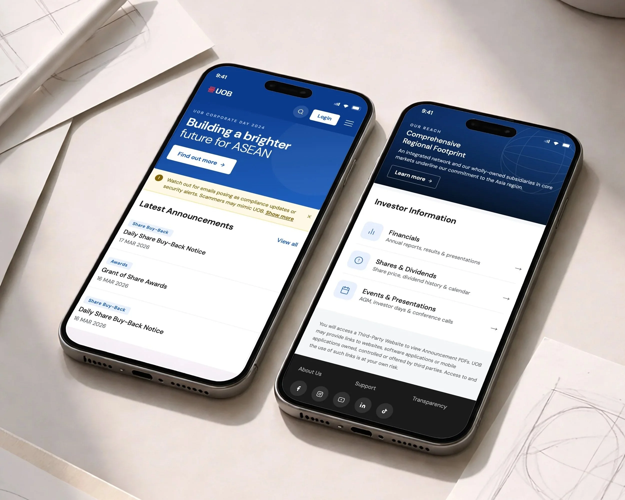
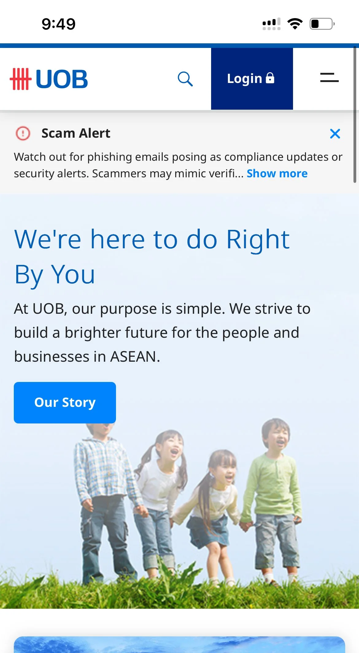
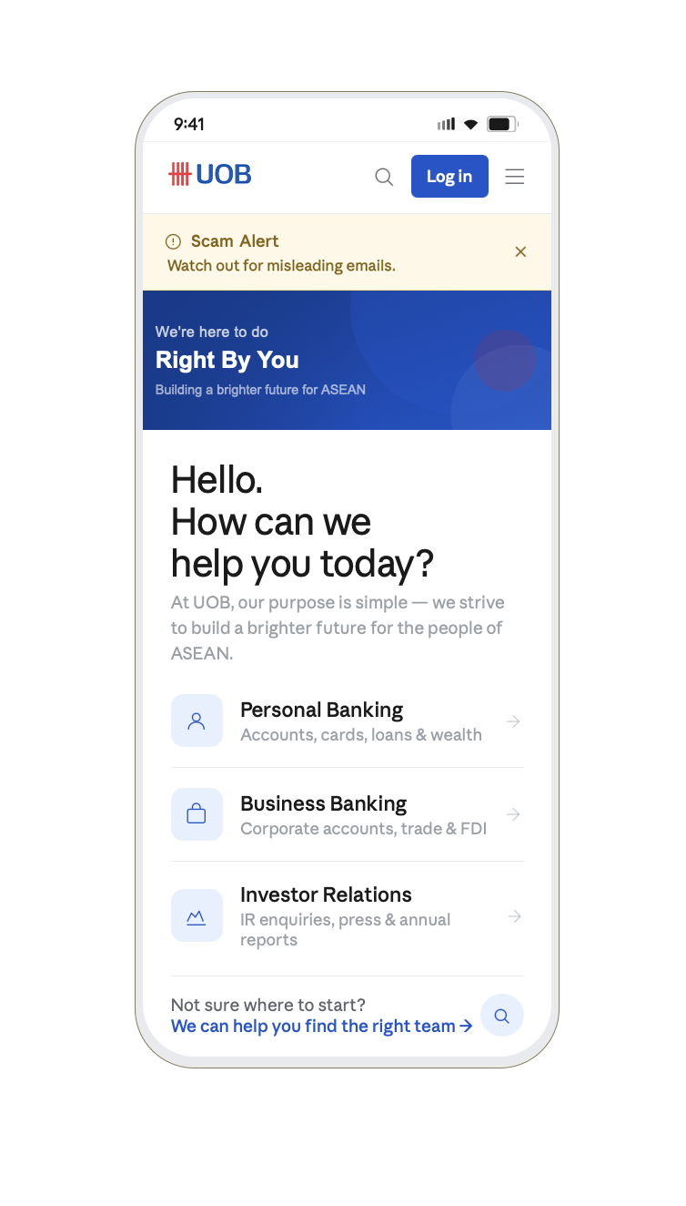
Before
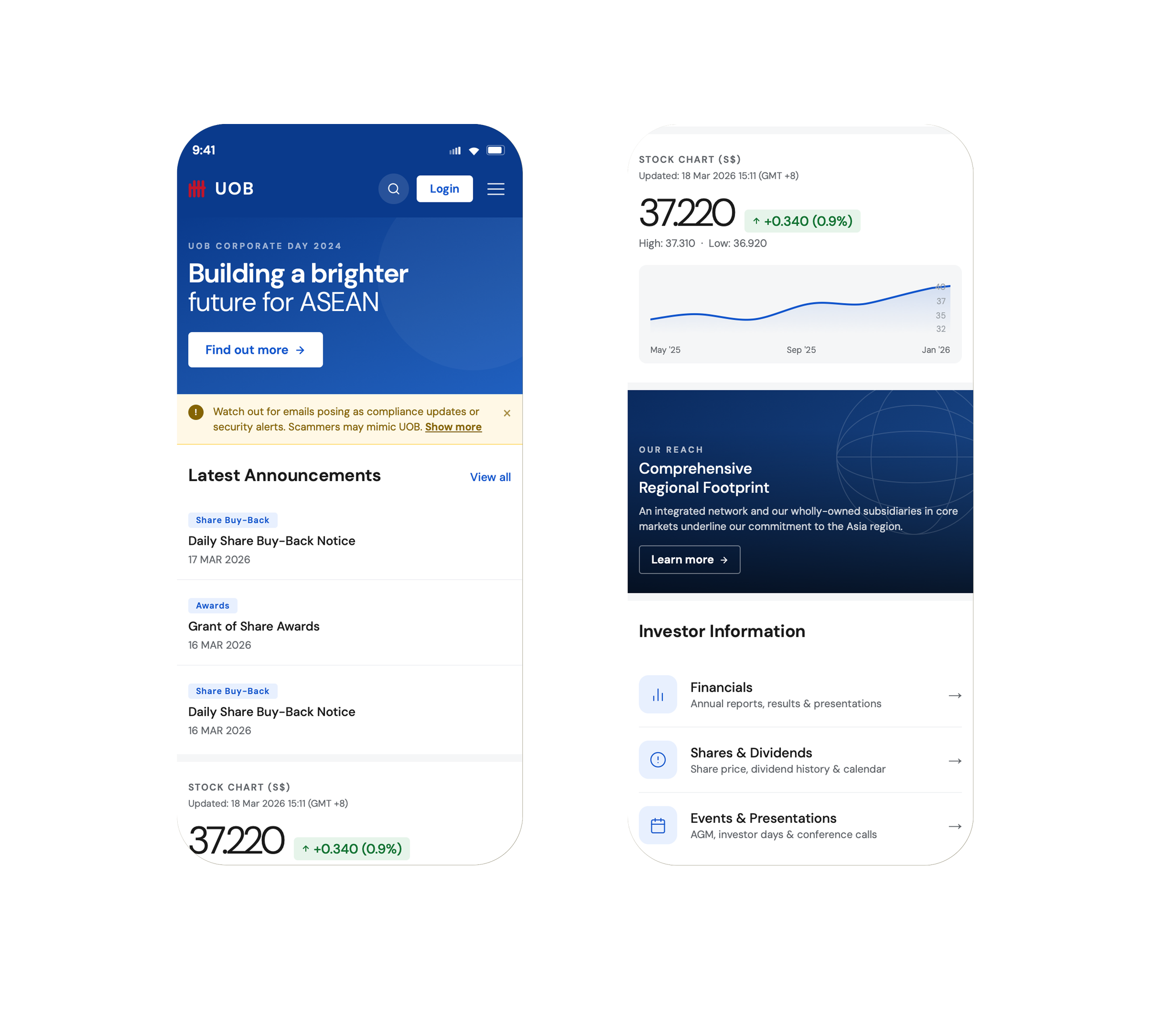
After
Unclear visual priority: Key elements share similar visual weight, making it difficult for users to quickly identify what is most important.
Unstructured content flow: Information is presented in a flat, continuous layout without clear grouping or hierarchy.
Reduced clarity and focus: Limited labelling, visually heavy elements, and competing components create a less intuitive experience.
Defined visual hierarchy: A strong focal point and thoughtful typography guide users effortlessly through the content.
Structured and intuitive layout: Content is clearly organised into distinct sections, improving navigation and understanding.
Enhanced clarity and experience: Cleaner visuals, purposeful labelling, and consistent design create a more confident and user-friendly interface.